CONTEXT
Inconsistency Passwords Submissions
The product team identified that users experienced frustration when creating or resetting a password. This resulted in churn during user acquisition (drop-off during registration flow) and operational load (increased volume when resetting password flow).
Our hypothesis was that Traveloka had different password submission experiences across interfaces. This was supported by the data shared by the product team, including:
Users often did not know the accepted password criteria, leading to failed submission attempts. These were estimated at 40k–70k during registration and 20k–30k during password reset.
Separately, users often created weak and easily guessable passwords (e.g., simple numeric sequences or keyboard patterns), which were easily breached by fraudsters.
This inconsistency raised a concern, given Traveloka's expansion into Japan and South Korea. A frustrating password experience could cause new users to abandon Traveloka before they even had the chance to make a purchase. That is the risk the team wanted to avoid, as it worked against the broader user acquisition goals.
So, based on these findings, the team aimed to reduce the frustration users experienced, lower operational costs, and improve the overall security of users' passwords.
RESEARCH
Competitive Research For Collecting The Data
I chose competitive research because it was practical for tight timeline and comprehensive for data collection, covering both direct competitors (Online Travel Apps) and indirect competitors (e-commerce) to reduce bias and identify sweet spot in password submission behavior. From there, I mapped the findings into 9 categories to help decide which opportunities were feasible to explore.

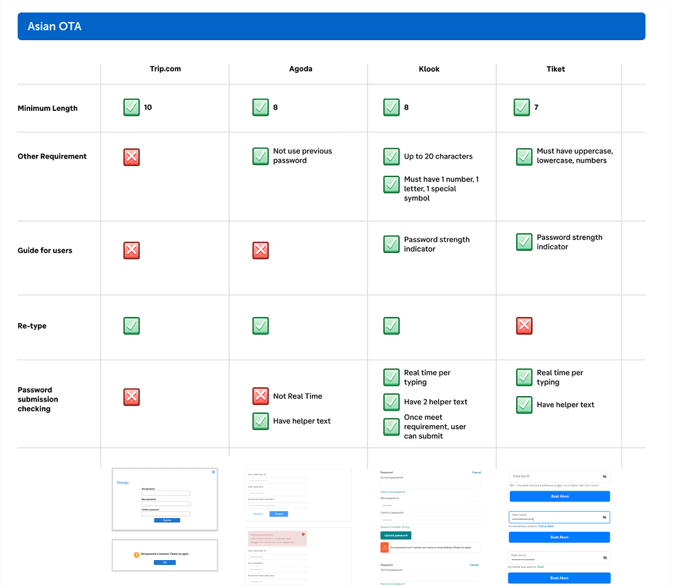
Image: Competitive Benchmark between Online Travel Apps (OTA)
Synthesizing The Data and Insights
The categories from competitive research were still the raw data, not an insight. That's why, I need to find the supporting insights to help me decide which the categories were feasible to explore. The challenge was that user research was not scoped into the project from the beginning. To help close this gap, I decided to explore the independent research from Baymard Institute. Baymard Institute provided a lot of extensive research and the performance comparisons across online platforms. From this research, I identified four relevant key insights:
Avoid Complex Password-Creation Requirements
As a recommendation, 8 characters minimum is enough because...
Read more
Categories:
Minimum Length
•
Password Requirements
•
Strong Passwords Recommendations
It can be a combination of uppercase, lowercase, numbers, and symbols...
Read more
Categories:
Password Requirements
•
User’s Guidance
•
Show All Requirements Upfront
Clearly list all requirements upfront, such as providing an inline positive validation...
Read more
Categories:
Password Requirements
•
User’s Guidance
•
Password Submission Checking
•
Always Provide Un-mask Passwords Capability
Practically, having a masked password can lead to typos. Allowing users to unmask...
Read more
Categories:
User’s Guidance
•
Password Submission Checking
•
IDEATION
Explore with Crazy-8 Concepts
I started with a Crazy 8s exercise to help find diverse solutions. Due to the tight timeline and limited resources, the session was explored alone. To reduce bias, I wore multiple hats, not only as a UI/UX Designer, but also as a copywriter, Product Manager, and Engineer, though this still carried some degree of bias.
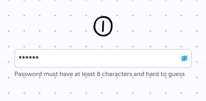
Single Inline Guidance

Send Magic Link

Multiple Criteria Inline Validation

Password Suggestions Generator

Security-level indicator with progress bar

Guidance with Modal/Pop-Up

Guidance with Accordion

One Line Security Password Indicator
Image: Several ideas were explored using Crazy 8s
HiFI iteration
Password Requirements & Validation Design
I explored four ways to display password validation feedback. I chose the design that shows the requirements upfront with a positive tone, which helps avoid pressuring users when creating passwords. The requirements are keep short (four critical items) to save vertical space and reduce complexity.

Showing Error Message Real Time

Strikethrough Update as Met

Appearing and Disappearing Error Message
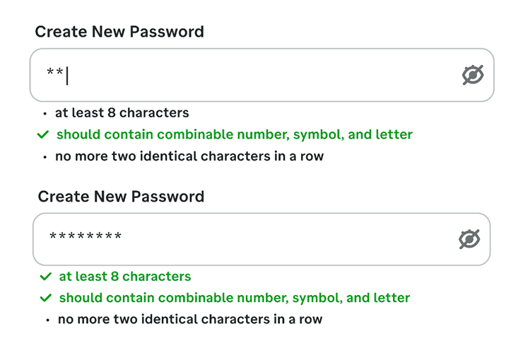
Checkmark and Color Update as Met
Image: Hifi Exploration on How to Display the Password's Validation
Supporting Design Alongside Password Requirements
I also explored three ideas that might help to reduce friction outside passwords requirements. The team was interested in the magic link option, but it needed further security review. So, I prepared a hygiene flow for the product team to use whenever that discussion happens with the cybersecurity team.

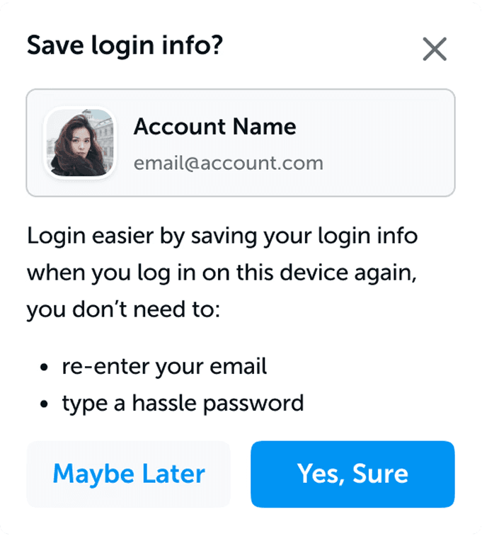
Improving The Save Login Usage


Use Magic Link Instead When Password is Forgotten
Image: HiFi Exploration as Supporting Improvements
IMPACT
Results After Launch
After the project shipped, we tracked the impact across platforms over the following months. The results showed meaningful improvement in both user experience and operational load.
Overall forgot password success rate
80-83%
→
88%
Password submission errors/ month
↓12,400
•
33k
→
Android success rate
84.3%
→
91.9%
MWeb success rate
84.6%
→
DWeb success rate
82.2%
→
Flat (no measurable change)
REFLECTIONS
What I'd Do Differently
Dig deeper into platform-specific issues instead of applying one solution to everything. DWeb's success rate stayed flat after this project shipped, while other platforms improved. That's a sign the standardized flow didn't fully solve what was different about the DWeb experience.
Loop in the cybersecurity team earlier, even informally. Defining clear criteria for weak, medium, and strong passwords was flagged as something for that team to handle, but we never actually got to collaborate with them during this project. Getting their input before the design phase would have been more useful than leaving it as an open item.
Involve at least one or two other people in the ideation process. I did the Crazy 8s exploration alone because of the tight timeline. I tried to reduce bias by thinking through different role perspectives, but doing it solo still has real limits. Having even one more person involved could have caught ideas or blind spots I missed on my own.