Optimizing Credit Card Usage for Higher Payment Success with Nearly 0% CVV Input Error Rate
Team
· Product Manager,
· Copywriting,
· Engineering
Role
· UI/UX Designer
Timeline
· 3 weeks
· March 2023
Tools & Skills
· Figma
· Guerrilla Testing
· Illustrative Icon
Impact
·
CVV errors ~2% → nearly 0%
·
Front-end failures ~3% → nearly 0%
CONTEXT
Make Relevancy with Global Expansion
As the app expanded to a global audience, the payment process needed to support them better. Credit card was the primary payment method for these users. But, the payment data showed the high failure rate when users input CVV. That's why, team want to reduced this number to avoid the volume increasing after the global realease.
Business Goals
Reduce the number of CVV input failure
Increase payment success rate
Stay competitive and relevant in global market
My Role
I acted as the UI/UX designer and Design PIC. As UI/UX designer, I mapped the usability problems, ran competitive desk research, conducted usability testing, and designed illustrative icon. For Design PIC on this project, I owned the design process works well, from problem framing through release.
Research
Auditing The Existing Design
Auditing the existing design helped me understand the design decisions that was made in the past. I also validated my assumptions about every design performance with data team and did quick desk research with competitors. The Key insights are:
The copywriting label for expiry date card field did not match how users read a physical credit card that users usually use.
There is no format date placeholder that acceptable for expiry date field. Considered, each country has a different format type of date, it will lead the frustration to complete the payment. The best case is to make one format that apply to all.
The question mark icon was not clearly clickable, and its tap area was too small, highly chance to miss clicked.
The tooltip content did not clearly explain the CVV for each type of cards. Its placement also covered the credit card number field, blocking users from seeing or completing that input while the tooltip was open.
The term "CVV" did not cover all card types globally. Ideally, the label name should be personalized depending on the user's card

Ideation
Exploring Design Solutions
Coachmark as a Tooltip Replacement

Rewriting The Expiry Date Copywriting
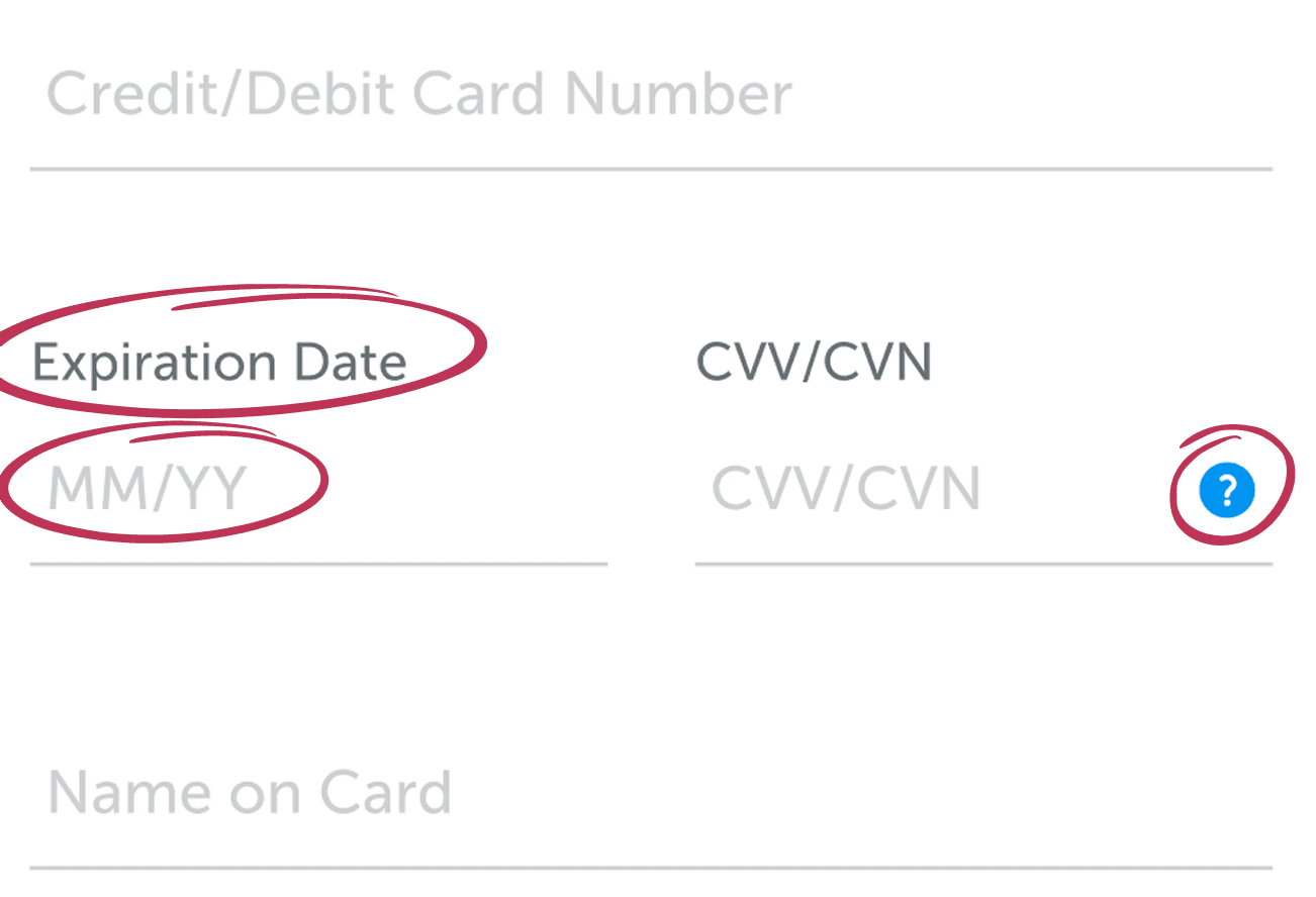
I recommended matching the expiry date copywriting with the physical card, avoiding a new term that can increase the cognitive load because confused during payment. I also updated the expiry date placeholder format. Using a familiar format helped reduce failed attempts.
Illustrative Icon as an Alternative to The Help Icon

Competitive research showed some platforms use illustration instead of text to explain the CVV location. This solution communicates faster than words. The challenge was to make it clearly visible in small screen. So I adapted the illustration based on the exact CVV placement for each card type on physical card type: back of card for Visa or Mastercard, front of card for AMEX, where the CVN sits.
Key challenge
Validating The Illustrative Icon

The illustrative icon needed to stay readable at a small size without becoming too prominent on the payment page. To validate the assumption, I ran a guerrilla test with internal employees, each taking about 5 minutes. The test checked some assumptions: whether the icon was readable at small size, whether users preferred the question mark icon or the illustrative icon, and whether users need the combined visual version to find further information related to CVV.
The result showed no clear preference between these solutions. I discussed the finding with the design team, to ask their perspective. We agreed to show both icons together, since there was no meaningful risk in doing so.
FInal design
The Final CVV Field Across Flow

The payment page used a modal bottom sheet for the CVV field, keeping the page from becoming long.

In other flows, like Pay at Hotel, the same field used a pop-up with a hide-and-show transition, keeping the information within the flow instead of navigating users away.
Impact
Results After Launch
Data was monitored for 3 months after release.
CVV-related errors on credit card payments dropped to near 0%, from approximately 2% before the change.
The copywriting changes for validation errors tied to the label and placeholder dropped to near 0% at the front-end level (attempts), from around 3% before the change. This supports the hypothesis that vague terminology and unfamiliar labels were a meaningful driver of failed attempts, though other factors may have contributed as well.
REFLECTION
What I'd do differently
Copywriting had a real impact on conversion and error rate in this payment flow, not just visual design.
Constraints, like limited space for the illustrative icon, did not limit the exploration. Working through that constraint led to a solution that communicated better.
Relying on the team to make a call, instead of extending the timeline to validate every assumption alone, was more effective. Teamwork helped me catch a bias.
The data was not tracked by platform, only combined. Next time, I'd set this up earlier to see the impact more clearly.