Simplifying a Complex Verification Flow for an Impact Investment Platform (IIX).
Project Overview
A verification interface designed to support the review and validation of impact-related data within an impact investment platform. The system enables internal reviewers to assess submissions, track verification progress, and confirm data consistency before approval.
Context
The platform manages impact and data submitted by issuers as part of the impact investment by doing the orange bond alignment.
Verification is a critical step to ensure the credibility, accuracy, and consistency of submitted information before confirmation and reporting.
Reviewers require a clear and structured interface to review submissions, reference supporting documents, and validate data across multiple criteria efficiently.
Goals
Support accurate and consistent verification of submitted data.
Reduce friction in the review and approval process.
Improve clarity when comparing values, documents, and verification status.
Provide clear visibility of progress across multiple verification stages.
Role
As the UI/UX Designer, I translated verification requirements and review workflows into clear, structured interfaces. I focused on designing data comparison views, status indicators, and review actions that support careful evaluation and decision-making. I also worked closely with the product team to align the interface with verification logic and compliance needs.
Timeline
February 2025 - present
Type
B2B · Enterprise · Web Desktop
Verification Flow Overview
Challenges in the Existing Verification Flow (Before Redesign)
The existing verification flow relied on long, form-heavy pages with many detailed questions repeated across multiple sections. For reviewers, this made it difficult to maintain focus while interpreting complex requirements, checking percentage-based inputs, and reviewing supporting information at the same time.
Although the flow was divided into sequential steps, the structure did not sufficiently support the review task within each step. Reviewers still needed to scroll through lengthy content, move back and forth between fields, and manually track what had been reviewed or completed. This made progress within a step less visible, especially when dealing with dense, compliance-oriented assessment content.
Another challenge was the separation between data inputs and supporting documents. While document uploads were required, the interface did not clearly indicate how evidence related to specific questions or whether all required materials had been provided. As a result, reviewers often needed additional checking or clarification to confirm completeness.
Overall, the existing flow made the verification process more effortful than necessary, highlighting the need for clearer structure, better readability, and stronger alignment between inputs, evidence, and review actions.


DEVELOP DESIGN SYSTEM
Colors

The color palette was designed to support clarity, trust, and consistency across the verification interface. Primary colors are used to establish a calm and credible visual tone, suitable for data-heavy review and assessment workflows. Secondary and neutral colors help structure dense content, ensuring readability across long forms, tables, and comparison views.
Accent colors are applied selectively to highlight verification status, progress, and key actions, allowing reviewers to quickly identify important states without overwhelming the interface. The palette was also structured to remain flexible and scalable, enabling consistent use across different modules while maintaining clear visual hierarchy and accessibility in a desktop-focused environment.
Typeface

The typography system was designed to ensure consistency, readability, and scalability across the verification interface. A single primary typeface is used to maintain visual coherence in data-heavy and text-driven screens.
A defined type scale establishes clear hierarchy for headings, body text, labels, and helper text. These styles are implemented as typography tokens, enabling consistent usage across components and centralized maintenance as the system evolves.
Components

The component system was built by prioritizing the most frequently used and functionally critical components needed for the verification workflow. Rather than creating a full component set, the focus was on establishing core building blocks that support forms, data review, and status-based interactions.
Selected components such as input fields, tables, status indicators, action buttons, and modals were designed with consistent structure and behavior to ensure reliability across screens. By defining only essential components, the system remains lightweight, easier to maintain, and flexible for future expansion as additional needs arise.
HIGH FIDELITY OF VERIFICATION PROCESS
Introduction

The introduction when start the verification
When starting the verification, the introduction will show to give disclaimer to users. This disclaimer to make giver user consent and the secure of IIX platform.
give the option does users have any framework that saved on Impact Investment Platform (IIX) before. This flow is hassle-free for users because they no need to start from zero to do verification that they saved before.
Issuance Profile

The input field adjusted with the type that suitable with users needs
This screen captures the core information required to initiate a new issuance within the verification flow. The form is structured into clear sections to separate issuer details, issuance data, and independent external reviewer information, helping users complete complex inputs in a systematic way.
Required fields, dropdown selections, and date inputs are used to standardize data entry and reduce ambiguity across submissions. The step indicator at the top provides visibility into the overall process, while the form layout prioritizes clarity and completeness for compliance-driven information before moving to the assessment stages.
Orange Bond Alignment

Expandable creates the page short and will open when needed
This screen supports the alignment assessment against the Orange Bond Principles by guiding issuers through a structured set of principle-based questions. The content is grouped by principle categories, allowing users to review requirements, select applicable criteria, and provide written explanations where necessary.
Expandable sections help manage dense policy and compliance information, while clear indicators show completion status for each principle. Rich text input fields and follow-up questions are provided to capture qualitative explanations and additional disclosures, ensuring that both structured data and narrative context can be submitted as part of the verification process.
Impact Confirmation

Impact Confirmation looks direct and clear what users must do

The action will show after users choose one of two options

The form that show when individual contact selected

The form that show when import bulk data selected

The example of the row when the individual contact added
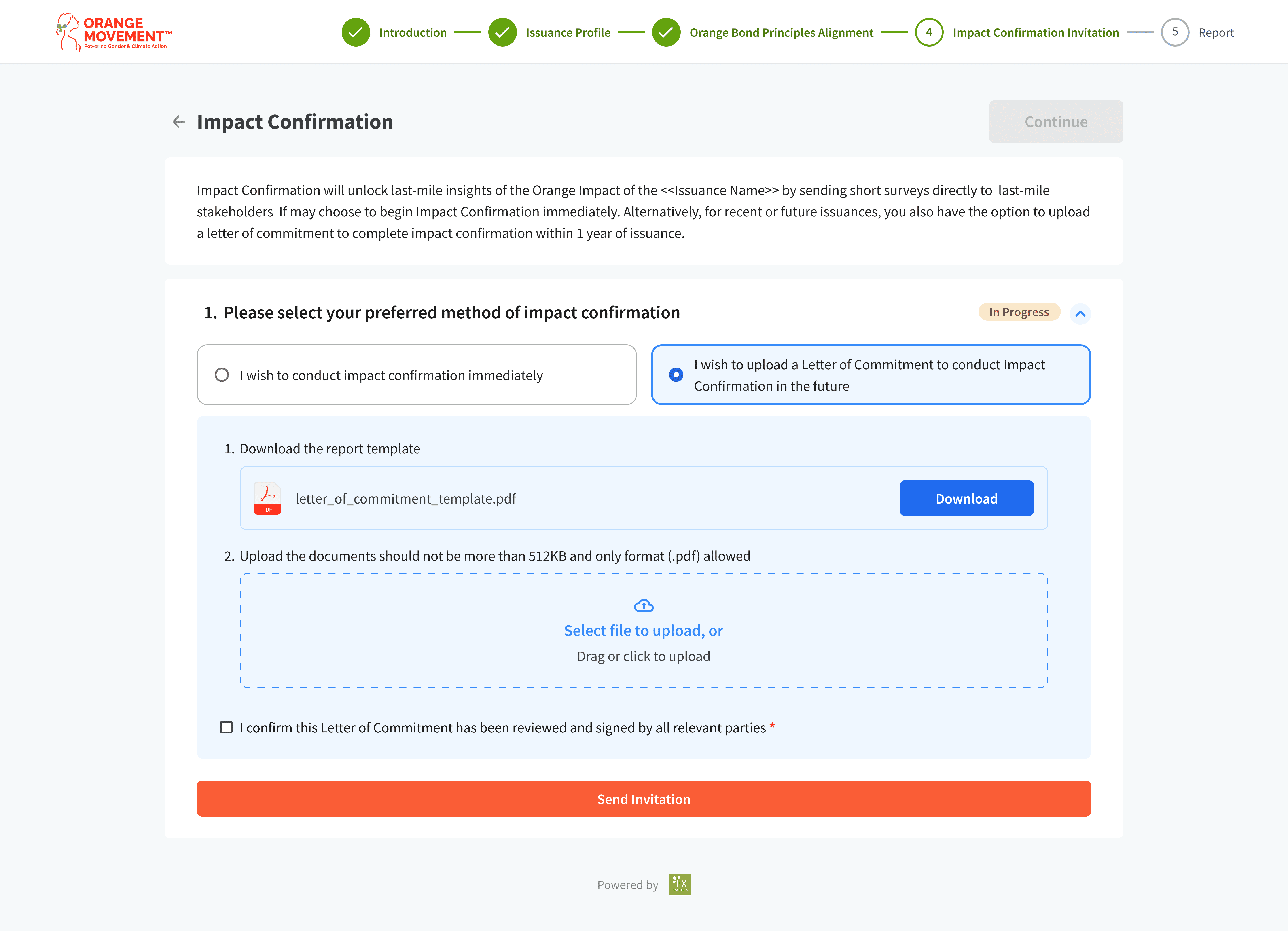
Form shows when users chose to upload Letter of Commitment
KEY CONSIDERATIONS
Using transition and interaction for long and detailed forms can help to reduce friction. So users can read, understand, and answer questions without feeling overwhelmed.
Organizing questions, documents, and explanations in a clear structure to make verification easier to follow.
Making verification progress and required actions visible so users know what has been completed and what is still needed.
Supporting both data input and written explanations, since verification requires numbers as well as context.
Using a calm and consistent visual style to support careful review and decision-making.
Creating Design System even not comprehensive can make work efficient even need spend an extra energy at the first.
DELIVERY & LEARNINGS
Delivery
The project delivered high-fidelity interface designs for the verification flow, including structured form layouts, review pages, and key UI components needed for assessment. The designs were organized in Figma with reusable components and clear interaction states to support development and future updates.
Reflections
Working on the verification redesign emphasized the importance of organizing complex information in a way that users can read, compare, and respond without feeling lost.
I learned how critical it is to balance long-form inputs and supporting context so users can focus on one task at a time without unnecessary scrolling or confusion.
This project strengthened my ability to structure interfaces where users must review, cross-check, and confirm data, rather than simply navigate or click through.
I gained more experience in designing with visibility of progress and actions in mind, ensuring that users can easily recognize what has been completed and what still needs attention.
The project reinforced the need to create clear component rules and layout patterns that work consistently across multi-step, multi-section processes.
It highlighted how design decisions can support confidence and accuracy in review-heavy workflows, especially in platforms that handle important or compliance-oriented information.