Designing Desktop CMS for Indonesian State-Owned Energy Company.
Context
An Indonesian state-owned energy institution was upgrading its digital ecosystem by integrating a redesigned internal CMS with newly developed internal applications. These tools are used daily by operational and administrative teams across multiple regions.
Goals
Unify workflows, create consistent UI patterns across platforms, and improve efficiency for teams handling field operations, reporting, and administrative tasks.
Role
As the UI/UX Designer, I translated requirements documents and defined workflows into clear visual designs for the internal CMS and integrated desktop web applications. I redesigned the information architecture and UI by considering the typical behaviors and working patterns of operational field teams and administrative staff who would use the system.
I created high-fidelity UI designs for dashboards, data tables, forms, and operational tracking screens, and ensured consistency by using unified color tokens and structured desktop components. Throughout the process, I collaborated with product and engineering teams to maintain alignment across all integrated systems.
Timeline
September 2024 - January 2025
Type
B2B · Enterprise · Web Desktop
PROCESS STAGE
Requirements → HiFi Exploration
Based on the workflow requirements, I structured the information architecture to clarify how each module connects, enabling smoother navigation for operational and administrative users. This is one of the example of the module with named "Keluhan Pelanggan" or english translated as Customer's Feedbacks.


FINAL DESIGN
Dashboard
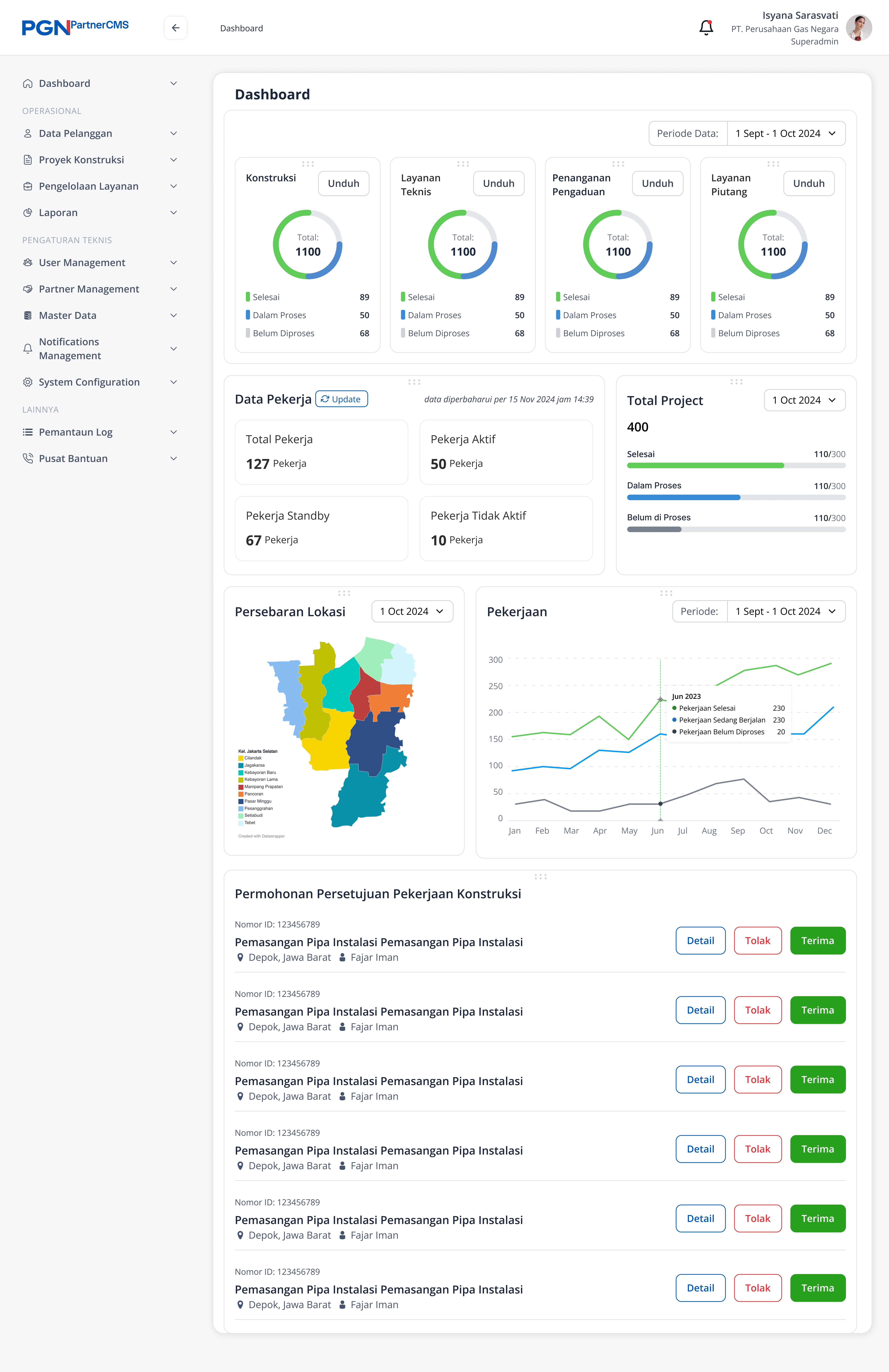
The dashboard layout was structured based on the need to surface high-level operational information in a single, scannable view. The summary of work was placed at the top using four cards to ensure high visibility and allow supervisors to quickly measure the status of each service category. Below the summary, the sections for "Total Pekerja" and "Data Pekerja" were positioned prominently because monitoring active, standby, and inactive workers is crucial for daily operational decisions and workload allocation.
The charts for "Persebaran Lokasi" and "Pekerjaan" were introduced to provide clearer insight into geographical distribution and monthly job trends. These visualizations were proposed after the initial discussion, as users were unsure what the dashboard should contain. I explored references for enterprise dashboards, created several visualization options, and presented them to help stakeholders decide whether charts like these were useful for their monitoring needs.
A list of construction approval requests was placed at the bottom because it represents actionable items that require follow-up after reviewing the overall operational status. This structure allows users to first understand the big picture and then proceed to task-level actions within the same page.
Customer

The customer list table demonstrates the interaction pattern for accessing actions through the three-dot menu.

The customer detail page shown after selecting a row from the table.
Work Order (Main Category)

This is the complete table that show the work table for "Pekerjaan Konstruksi". It looks the same with othes but differentiate with the action.
Work Order (Main Category)

A dedicated work table for Penanganan Piutang, using the same table structure while providing a different set of specific data
Report

The customer list table demonstrates the interaction pattern for accessing actions through the three-dot menu.

The customer list table demonstrates the interaction pattern for accessing actions through the three-dot menu.
User Management

Page that show the list of the user that access the CMS

The configuration of the permission from role of each users
KEY CONSIDERATIONS
Designed with desktop-heavy operational and administrative patterns in mind.
Structured information hierarchy to support frequent scanning and data entry.
Ensured scalable patterns for future module additions.
DELIVER & LEARNINGS
Delivery
The project was delivered with high-fidelity desktop UI designs, structured Figma components, and supporting documentation. The redesign improved clarity in navigation and information hierarchy, making daily operational monitoring and task management more straightforward for internal user
Reflections
Working on this enterprise CMS redesign reinforced the importance of clarity and structure when designing for operational systems. With limited formal documentation, the project highlighted how translating functional requirements into a clear information architecture can significantly improve usability.
The experience also strengthened my approach to designing data-heavy desktop interfaces, where information hierarchy, consistency, and predictability matter more than visual novelty. It was a reminder that in internal systems, small decisions in layout and interaction patterns can have a meaningful impact on daily workflows.